I always think about plants before I think about design. Garden design is barely even a consideration, but then I have an old suburban garden with established trees, bushes and existing garden areas. I’m limited by the size and shape of my piece of land, which is long and thin. I’m limited by the placement of my house, which is smack bang in the middle of the land. I’d love to have had a lot more land to play with, but I don’t. What I have are a series of small garden rooms or areas and a whole bunch of limitations, such as light, wind, road noise, neighbours, money and a big hairy dog.
I garden like I write. When I write a novel or a short story I just write. I plan nothing. I have ideas and I follow them like I follow lights along a dark path at night. I go wherever the story takes me. A lot of writers work this way. Once the story’s written I rewrite and rewrite and edit and edit and keep on editing until the story is knocked into shape. I use the same approach with my garden. I reckon a lot of gardeners do. I start with some plants I like and find somewhere to plant them. Then I find or grow some plants to fit around the plants I like. If I run out of room in the existing garden then I make a new garden on top of the lawn. My lawn, which used to be big enough for my son to kick a ball around on, is now only big enough for a picnic blanket and accompanying picnickers.
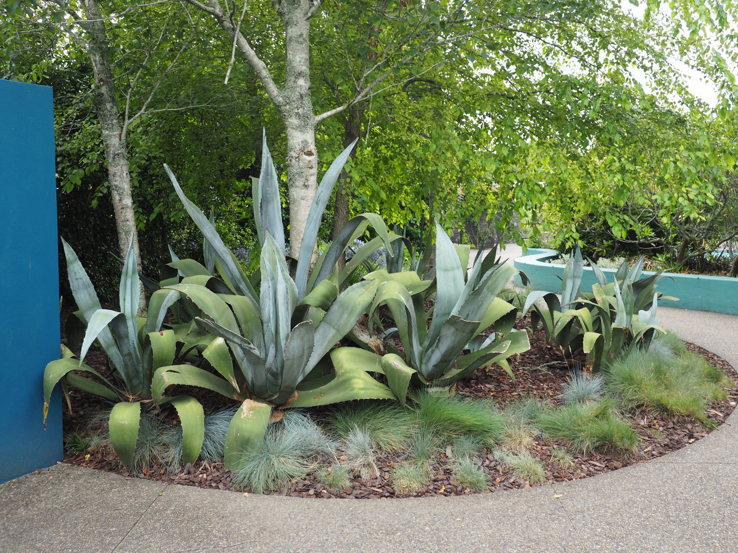
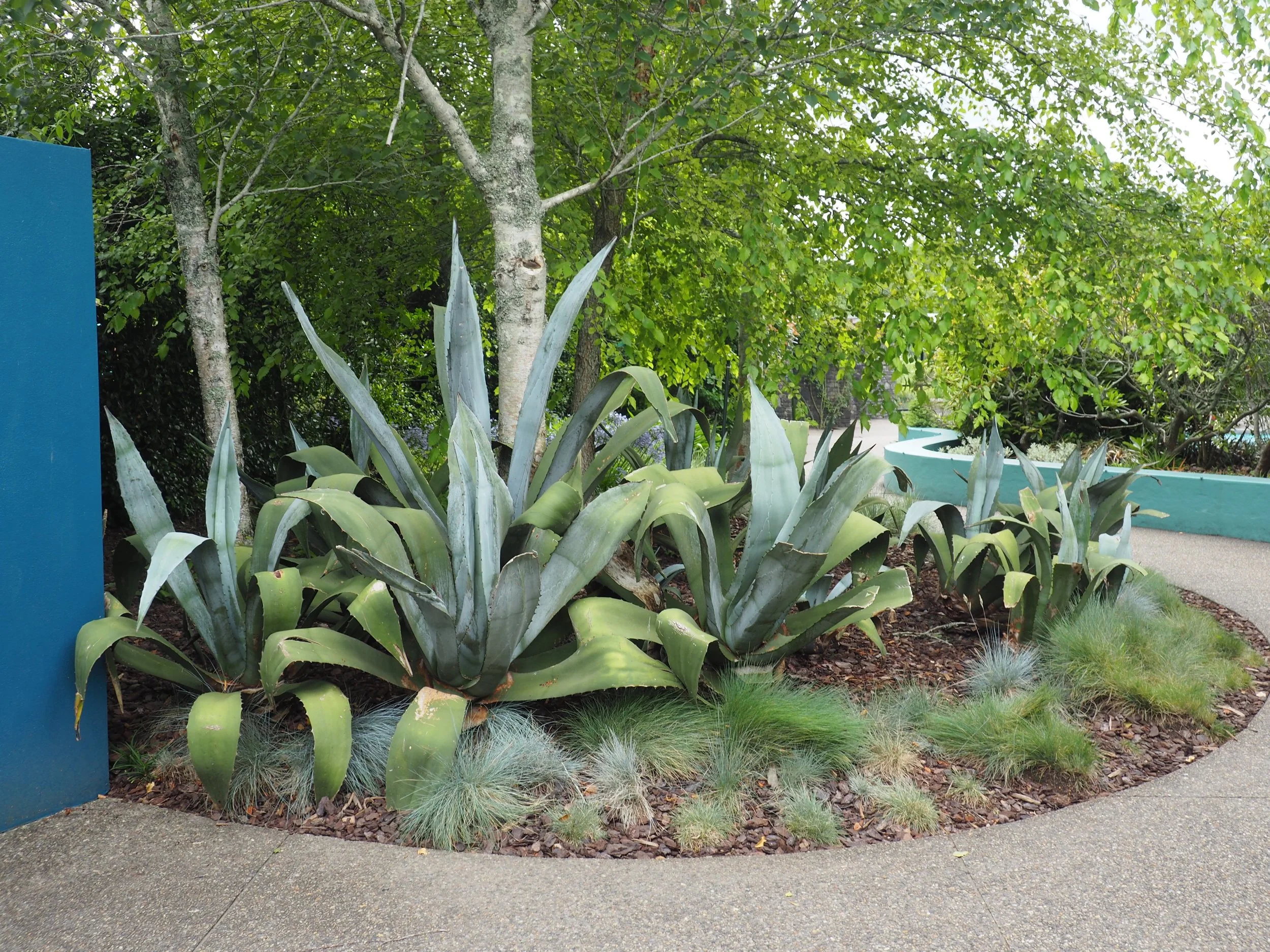
Here are two gardens that I visited at Hamilton Gardens a couple of weeks ago. They’re both very ordered gardens that are dominated by hard landscaping: one is geometric and the other is organic. The first garden is called ‘The Modern Garden’. It’s an interpretation of the sort of gardens that Thomas D. Church designed for Californians in the 50s, 60s and 70s. The second garden is modelled on much older and grander gardens from the 1500s - 1600s. It’s called ‘The Italian Renaissance Garden.’
Both these gardens have some similarities, for all their obvious differences. They’re designed for hot summers. For people who want to move seamlessly between indoors and outdoors and live in the outdoors as if they were indoors. Both gardens have hard landscaping with clean edges and are divided into different areas. Thomas D. Church was influenced by the design of Italian Renaissance gardens and borrowed some of their features such as pergolas, terraces, steps, clipped hedges and parterres. Thomas D. Church’s gardens were easy care gardens, whereas Italian Renaissance Gardens were looked after by a team of minions.
I’m fascinated by gardens that began life as a drawing on a page, where the hard landscaping is what gives the garden its structure, its order. For once I’d like to think of my own garden as a whole, rather than lots of seperate cobbled-together bits. This is a challenge for me because I’m a bohemian gardener at heart. A downright romantic. A plant-led gardener rather than a design-led gardener.
But I want to start 2019 with a garden plan and I’m hoping to get some inspiration from these two ordered gardens.
I’ll start with ‘The Modern Garden’garden, which most visitors, at Hamilton Gardens, walked in and straight out of. That’s because it was too familiar, a bit old fashioned and yet not old fashioned enough. Personally, I liked it (I think Thomas D. Church is up there with Capability Brown), but the design of this garden could’ve been a lot more mid-century modern. It feels a little ho-hum and yet it has some excellent parts.
So much of Thomas D. Church’s garden designs have become such a part of mainstream landscaping that it’s hard to see what made him so innovative in the first place. The kidney shaped pool, the no-nonsense perennial plants, the institutional feeling terrace overlooking the river. It could be the backyard of a long dead 70s socialite that’s been left empty for decades. Maybe that’s why the visitors to this garden barely glanced at it. They’ve seen it all before, in schools, motels, public areas and open homes.
Thomas D. Church designed incredible gardens. Check them out on the internet and you’ll see what I mean. Enormous decks on hillsides with cutaway holes for large trees to grow through; lots of timber, brick and stone; lush lawns with concrete mowing strips; curved gardens edged in low box hedges; lots of wide steps leading up and down to decks or terraces; big open spaces and small courtyards with pergolas and plants clipped and pruned - treated like architecture; and modern outdoor furniture with clean lines: tables and chairs, sun loungers, built in benches, umbrellas.
Thomas D. Church’s gardens were lush and ultra-modern in a big west coast way with a big nod to Italian Renaissance and Japanese gardens. ‘The Modern Garden’ needs to look more like a suburban garden for people and less like a public park.
This view of the river is stunning. Thomas D. Church would’ve designed this deck differently.
This is how he tells you how to ‘enjoy land you don’t own’. ‘Put as few obstacles and diverting lines as possible between you and your view if you want to retain its drama. The eye is fickle and easily distracted.’ (Gardens Are For People by Thomas D. Church)
This part of the garden is beautiful. Floor to ceiling windows overlooking a meadow that gives the impression of carrying on down the hill until it reaches the river. But as I stood there, under the cover, looking through the windows, I was overcome with the feeling that something was missing. The space, with its hard materials echoed and felt small.
Here’s the Italian Renaissance inspired garden. It’s majestic with its tunnel arbour, decorative pattern of beds filled with Mediterranean herbs and flowers, topiary, grand fountain, grape covered pergola, a double flight of steps, a grotto, pots of citrus trees and a villa overlooking the river.
My first impression was that it resembled a large suburban garden designed by someone who fell in love with ‘Under the Tuscan Sun’, that truely awful book from 1996. The garden was so new, the concrete walls, buildings and sculpture was all so bright. Was the garden merely a clever cliche of an Italian Renaissance garden?
My second impression, which is the one that stuck, was that this was a truely incredible garden: cleverly designed and generously planted. It showed that Italian Renaissance garden design could be translated into a contemporary setting, using contemporary materials. This was a garden with a lot of different rooms, some were grand and some were intimate. Aspects of it could easily be scaled back to a smaller garden.
I’ve come away with a whole lot of ideas on how to make my garden more ordered. I’m thinking about curves and topiary and plants that climb up walls. I’m thinking about meadows and terraces and plants in pots. I’m thinking about views and how to capture them. I’m thinking of marrying contrasting plants: ones that are heavily pruned or clipped living with plants that hang like hippies, sprawling in all directions. I’m going to think about all the possibilities, record them, draw them and spend a lot of time staring at my garden. Then I’m going to work out what to do first. That’s what next weeks blog will be about.
PS - Thanks Ali for lending me Gardens Are For People, which I love and is one of my most favourite, most thumbed (though very carefully), gardening books. I promise that one day soon I’ll buy my own copy and send yours back!


